
Yesterday, I went ranked all the jerseys from the AFC so today I’m continuing that with the NFC Edition. I honestly think this conference is going to be much tougher, at least it was when I was going through the teams in my head. I think I might surprise some people with this one.
16. Tampa Bay Buccaneers
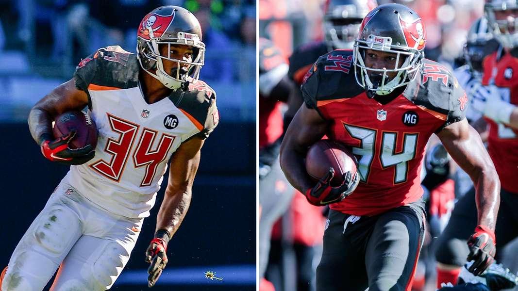
Photo Credit: http://www.sportingnews.com/
I tried so hard to like these and justify them but at the end of the day, these are just awful. The numbers are bad, both the font and the reflective secondary colors. The shoulders are bad. I wish they would have gone with black instead of the brown color they insist on using. The helmet is “eh” but still not great. They can try again in 4 years so now they can plan to get it right.
15. Arizona Cardinals
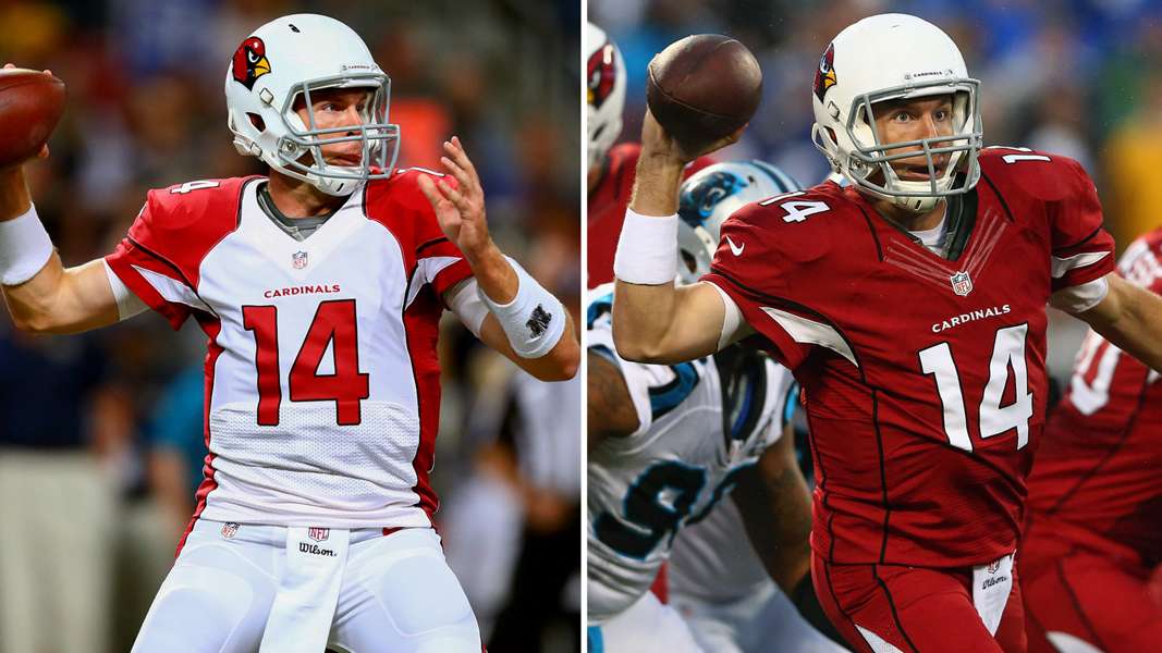
Photo Credit: http://www.sportingnews.com/
These were my least favorite jerseys, at least in this conference, until the Bucs threw up on fabric. Neither jersey is good with the white one being the worst. I hate the shoulders being different colors than the base of the uniform. Way too much red too. They could definitely use the white and black as more dominant accent colors.
14. Detroit Lions
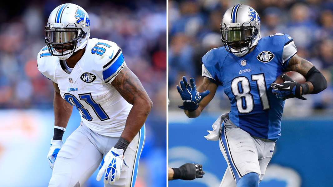
Photo Credit: http://www.sportingnews.com/
This is where the NFC gets tough. I don’t really hate too many of the jerseys in this conference. That said, the Lions could definitely get rid of the weird font they switched to a couple years ago. An alternate wouldn’t hurt either.
13. Atlanta Falcons
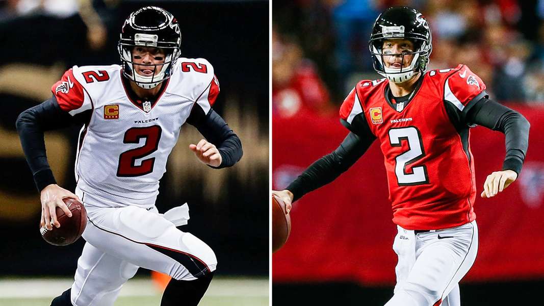
Photo Credit: http://www.sportingnews.com/
Nothing super wrong with these jerseys but the side paneling could go. Personally, I would have kept the black as the home jersey, but I can see why they went with the red. I wish they would mix in black pants every now and again.
12. St. Louis (Probably going to be LA) Rams
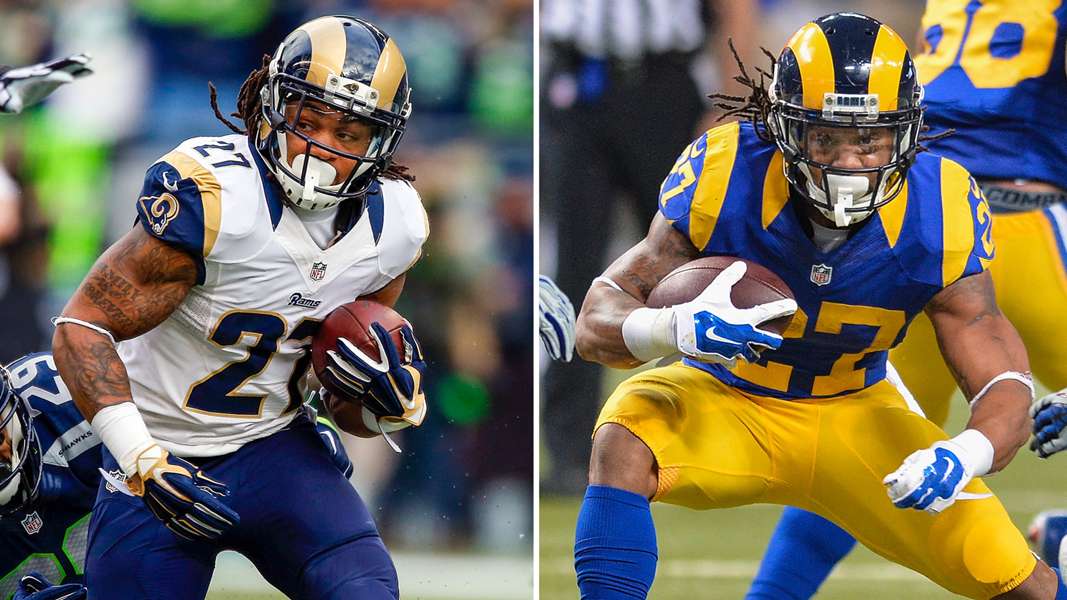
Photo Credit: http://www.sportingnews.com/
Some people don’t like the darker blue they adopted with the redesign in the early-2000s but I like it. I would get rid of the 3/4 collar, though. Their throwback alternates are top notch.
11. Seattle Seahawks
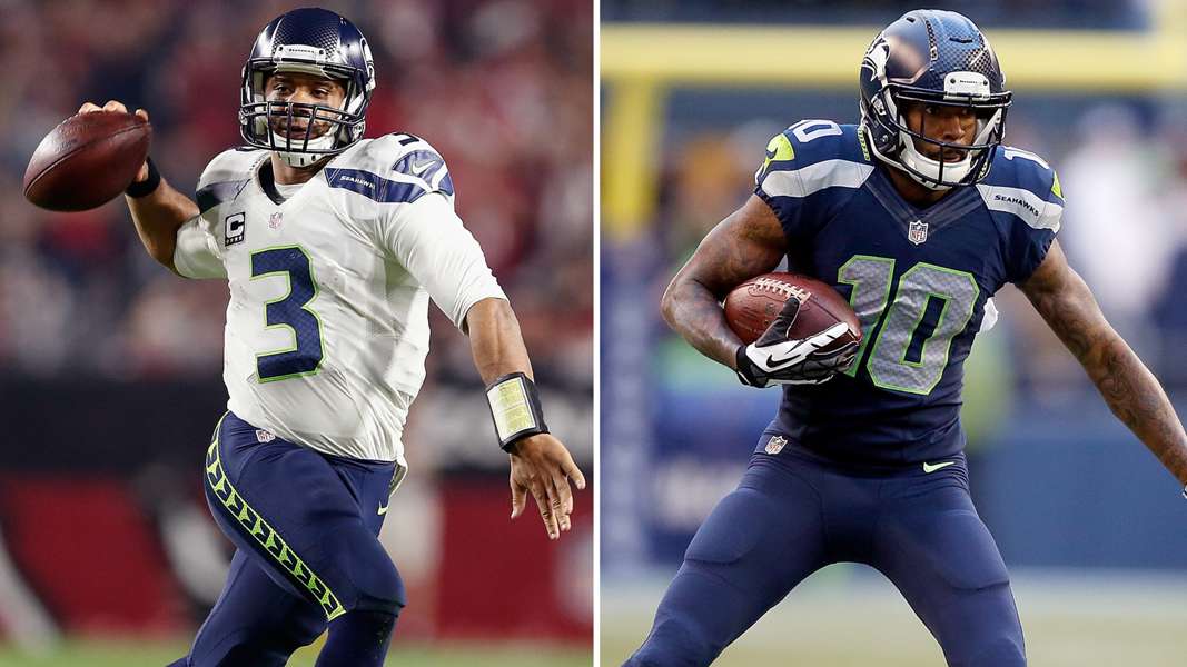
Photo Credit: http://www.sportingnews.com/
I really like these jerseys and I think, overall, Nike did really well with them. I love how they use the neon green as an accenting color. The reason why they are so low is because their wolf gray jerseys are a part of their set and I hate those. I hate gray football jerseys with a passion. If you’re going to make an alternate, either have it be a throwback or in an accenting color, which in this case, would be green which I’m ok with.
10. San Francisco 49ers
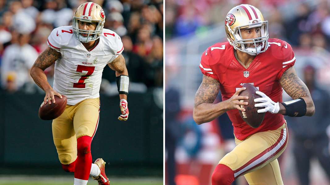
Photo Credit: http://www.sportingnews.com/
Speaking of terrible alternates, the 49ers are this low because of their newly released ones. Granted, we haven’t seen them on the field but I have absolutely no idea why they chose black. The red numbers on the black with no accent does not look good. They have timeless home and away jerseys and they went and wrecked that with an awful third.
9. New Orleans Saints
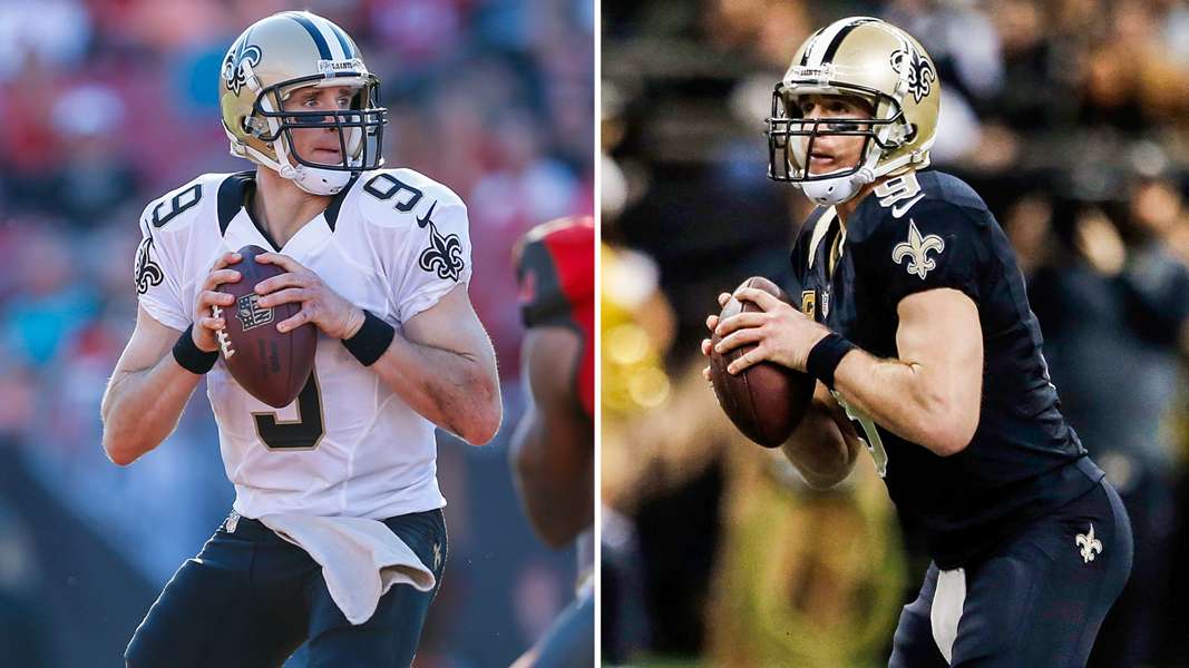
Photo Credit: http://www.sportingnews.com/
Simply put, these jerseys are sharp. Aside from the stupid collar, there is nothing wrong with them. I love the all black look and I like when they mix in the gold pants too. I do wish they would bring back the gold alternate though, that was pretty sick.
8. Washington Redskins

Photo Credit: http://www.sportingnews.com/
Say what you will about the team name, the jerseys the Skins wear are great. They are simple and they keep the team’s history in tact. The full time addition of the yellow pants a couple years ago made me like the jerseys a lot more.
7. New York Giants
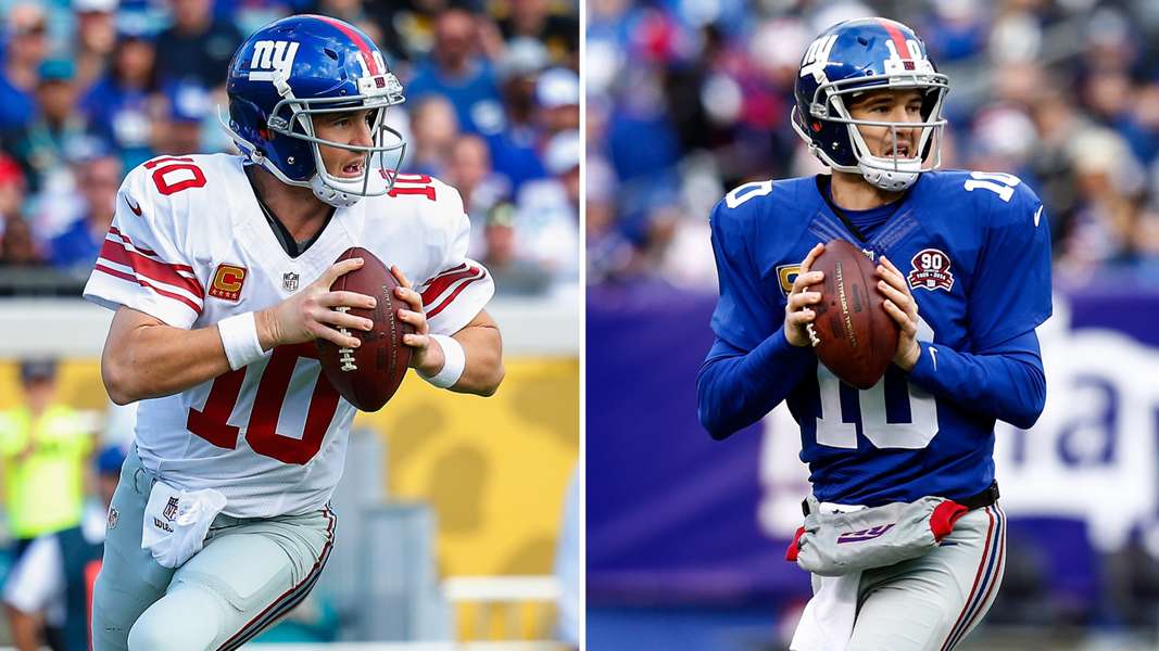
Photo Credit: http://www.sportingnews.com/
These jerseys are also classics. Nothing needs to be done with them. I love the simplicity and nod to the history of the team. The addition of white pants last season was a cool touch which allows for some good looking alternate jersey sets.
6. Philadelphia Eagles
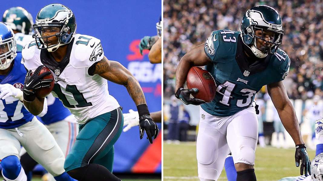
Photo Credit: http://www.sportingnews.com/
I know they are reportedly changing back to Kelly Green within the next couple years but i like the jerseys where they are now. I like the midnight green-white-black color combination and it works very well for them. Their alternate black jersey is one of my favorites. The only thing I would do differently is making the wings on the helmet bigger.
5. Carolina Panthers
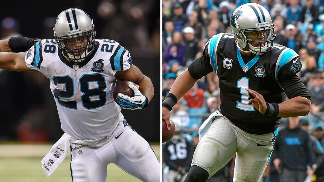
Photo Credit: http://www.sportingnews.com/
Another set of jerseys made better by an addition of another set of pants. Adding the black pants a couple years ago gave the Panthers one of the best sets in the league. I only wish they would switch to a black helmet. If they did that, these would probably be my favorite in the NFL.
4. Green Bay Packers
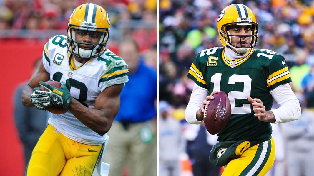
Photo Credit: http://www.sportingnews.com/
The Packers’ jerseys are probably THE classic jerseys in the NFL. They are timeless and they represent winning. Nothing too much else to say here. Just a great jersey set.
3. Chicago Bears
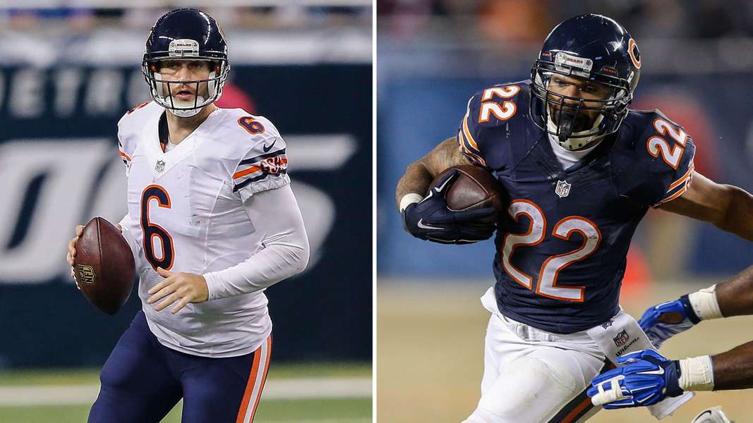
Photo Credit: http://www.sportingnews.com/
The Bears also have a classic set which puts them up here but they jump the Pack because of their alternate. I LOVE their alternate jerseys. The dark blue with the orange and no accent works and it works very well.
2. Minnesota Vikings
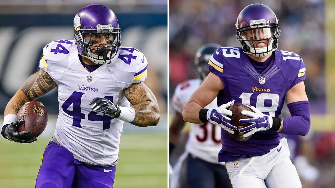
Photo Credit: http://www.sportingnews.com/
This is my absolute favorite of the Nike redesigns. They have a simple yet elegant jersey that doesn’t try to do too much. i love the numbers and how one is serif while the other is sans. I love the stripes on the arms. The matte purple helmet is another great touch. Nike created a timeless look that will last for generations.
1. Dallas Cowboys
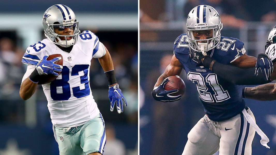
Photo Credit: http://www.sportingnews.com/
Perfect. These are truly perfect. The look is timeless and their blue jersey is one of my favorites in the league. The helmet is iconic and the look has never changed.
Agree with me or want to scream at me? Tweet at me or leave a comment!
