
Welcome to the worst part of the sports’ calendar. Baseball is heading into the All Star break, NFL Training Camps haven’t started quite yet, NHL Free Agency has cooled down tremendously, and the NBA is getting weird with DeAndre Jordan basically getting kidnapped in his own house last night. Now is the perfect time to rank the jerseys in each of the major sports leagues (NFL, NHL, MLB, NBA). Each league will be broken down into conference then have a league wide Top 5. Without further ado, let’s get started.
Phil Hecken from Uni Watch did his rankings (here and here) for Sporting News and while I agree with some of his rankings, I do not agree totally. We’ll start at 16 then move up the list from there.
16. Tennessee Titans
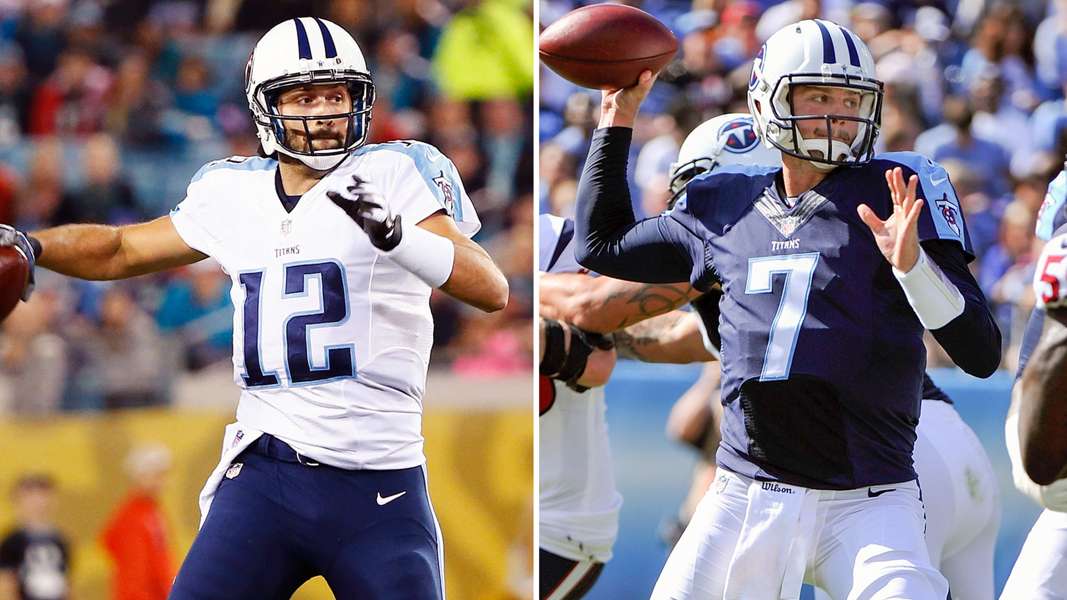
Photo Credit: http://www.sportingnews.com/
The color scheme is great but nothing else is. The Titans have had this jersey since they became a team and it desperately needs an update. The colored shoulder needs to go.I would probably also get rid of the Flaming T logo and make the secondary sword logo the primary.
15. New England Patriots

Photo Credit: http://www.sportingnews.com/
A team also in need of an update, or preferably a throwback, is the Patriots. I was never a huge fan of these jerseys and they absolutely need to make their new jerseys in the template of their red throwbacks. If they add a blue and white jersey in that style with a white helmet, they will have the one of the best jerseys in football. The helmet is boring and could use a stripe or something to liven it up. They could also add some accenting colors to both jerseys too.
14. Cleveland Browns
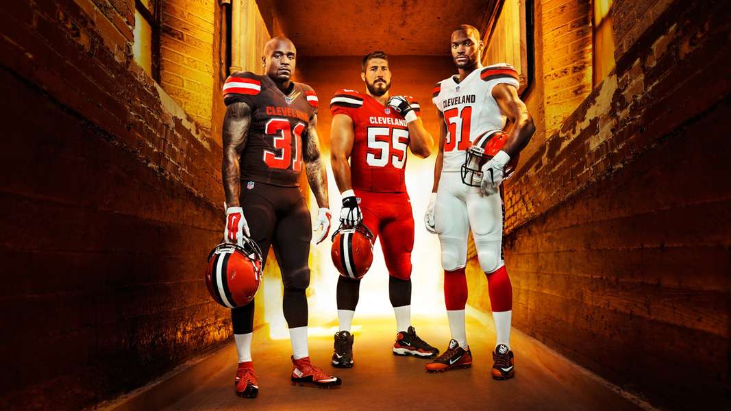
Photo Credit: http://www.sportingnews.com/
Welp, they tried. Not a huge fan of the new jerseys but they have some cool elements. I do like the new helmet a lot and the inclusion of an orange alternate was a nice touch. I wish they would have gone with white numbers on the home jerseys with an orange accent instead of the opposite but hey, they didn’t ask me. The white jersey is my favorite of the new set.
13. Jacksonville Jaguars

Photo Credit: http://www.sportingnews.com/
A lot of people hate these but I actually like them. I think we all can agree, though, the helmet is a crime against humanity. If it was just the matte black, this jersey would be in the top 10 for sure. I like the elements and the color contrast in the look. Just get rid of that stupid helmet and we’re all good.
12. Cincinnati Bengals

Photo Credit: http://www.sportingnews.com/
I hate colored shoulders, there I said it. The Bengals’ away jersey looks awful. I also don’t like the 3/4 collar either and there is a reason why teams got rid of that. Either go with an all secondary color collar or all primary one, don’t do this. Their helmet is awesome so nothing to change there. Not a huge fan of the font either.
11. Denver Broncos

Photo Credit: http://www.sportingnews.com/
Nike is apparently undertaking a huge remodeling of the Bronco’s entire look and they need it. The stripe that goes from the shoulder to the pant leg is awful. I like how the jersey is simple and they went back to the orange primary as a nod to their history, they just need an update.
10. Miami Dolphins

Photo Credit: http://www.sportingnews.com/
Clean and simple. When people think of Nike redesigns, they usually think of teams like the Bucs (I’ll get to them later). I love what Nike did here. Personally, I would add a little more orange and make the facemask teal instead of white but this redesign was done very well. Nothing really wrong with either jersey.
9. Baltimore Ravens

Photo Credit: http://www.sportingnews.com/
Another clean and simple look. The Ravens also sport one of the best alternate jerseys in football with their all-black look. Only thing I would change is a little more color on the black pants. A stripe on the pants would make them perfect.
8. Houston Texans

Photo Credit: http://www.sportingnews.com/
Another clean and simple jersey that does it right. The font is great and the red alternate is growing on me. I would add a little more color to the helmet to make it pop a little more but there is absolutely nothing wrong with their jersey set.
7. Pittsburgh Steelers
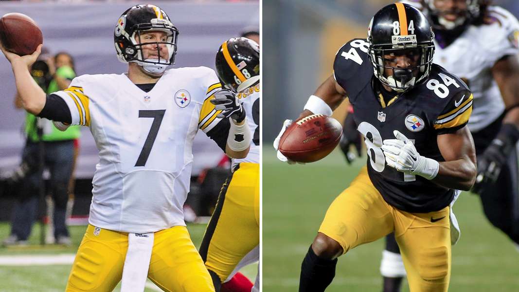
Photo Credit: http://www.sportingnews.com/
These would be higher on the list if it wasn’t for the Bumblebee alternate which is the second ugliest jersey in sports (looking at you Buffalo Sabres’ alternate). The Steelers’ look is timeless and has not been changed drastically in their history. There’s no reason to either; it’s a great set.
6. New York Jets

Photo Credit: http://www.sportingnews.com/
Another timeless look but this time without a vomit-inducing alternate. Despite their play on the field, the Jets always look good. Their look is clean with the perfect amount of accent.
5. San Diego Chargers
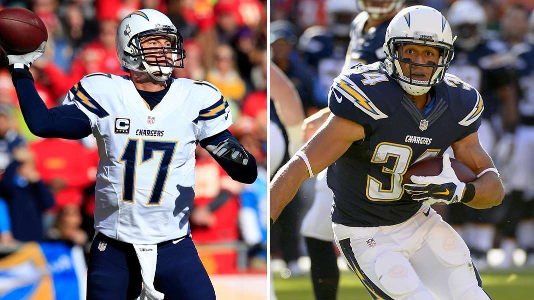
Photo Credit: http://www.sportingnews.com/
An updated version of their older jerseys, their current set is the perfect blend of old and new. The classic white helmet goes well with their updated look. They still have one of the best jerseys in football in their Powder Blue alternate.
4. Indianapolis Colts
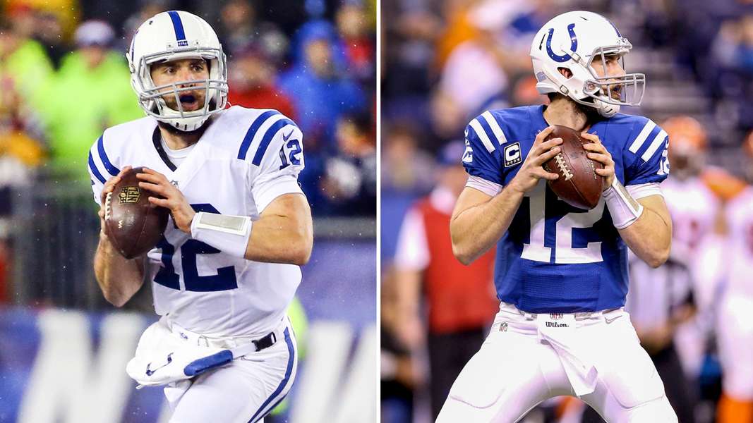
Photo Credit: http://www.sportingnews.com/
Nothing really to say here. Just a great, classic jersey that does not need to change. The part of the Colts that does need to change is their defense. Good news is that they’ll look good giving up 65+ points per game.
3. Buffalo Bills
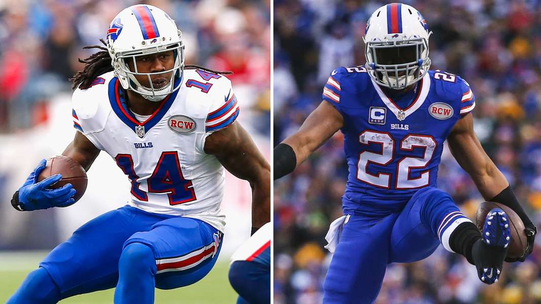
Photo Credit: http://www.sportingnews.com/
Everything about this set works. They can go with an all blue or all white look or a combination of both and they will look good week in and week out. They have created a timeless look that has acted as their jersey phoenix rising out of the ashes of crap that was their Bledsoe-era look.
2. Oakland Raiders
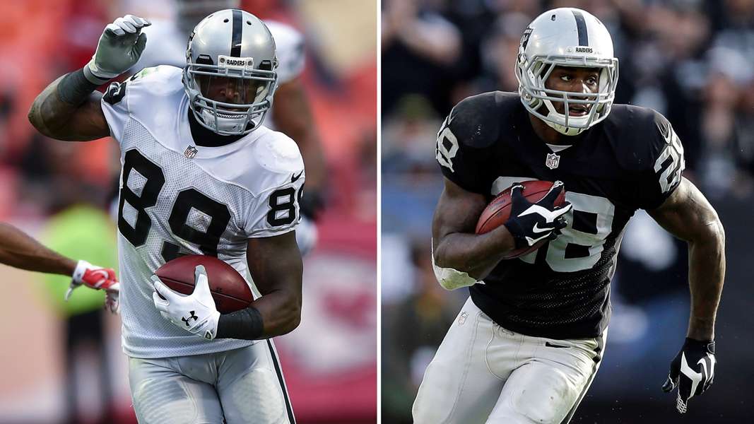
Photo Credit: http://www.sportingnews.com/
The Raiders are another team that knows their history and knows there is no reason to change it. From helmet down, these jerseys are great.
1. Kansas City Chiefs
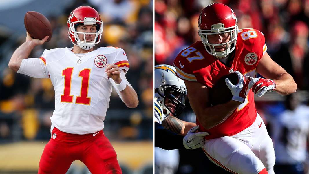
Photo Credit: http://www.sportingnews.com/
Like the Raiders, the Chiefs know they have a good thing and they know not to mess with it. They have had essentially the same jersey their entire existence and it still works. I also love that they have been mixing in all white and all red combinations to change it up every now and again.
Agree or disagree? Let me know on Twitter or in the comments!
